Saving Malta’s Music Memory
Maltese Music is being lost. Along with it Malta loses its culture, way of life, and memories. Dr Toni Sant is trying to change this trend through the Malta Music Memory Project (M3P)Continue reading
Cockneys vs Zombies — Film Review

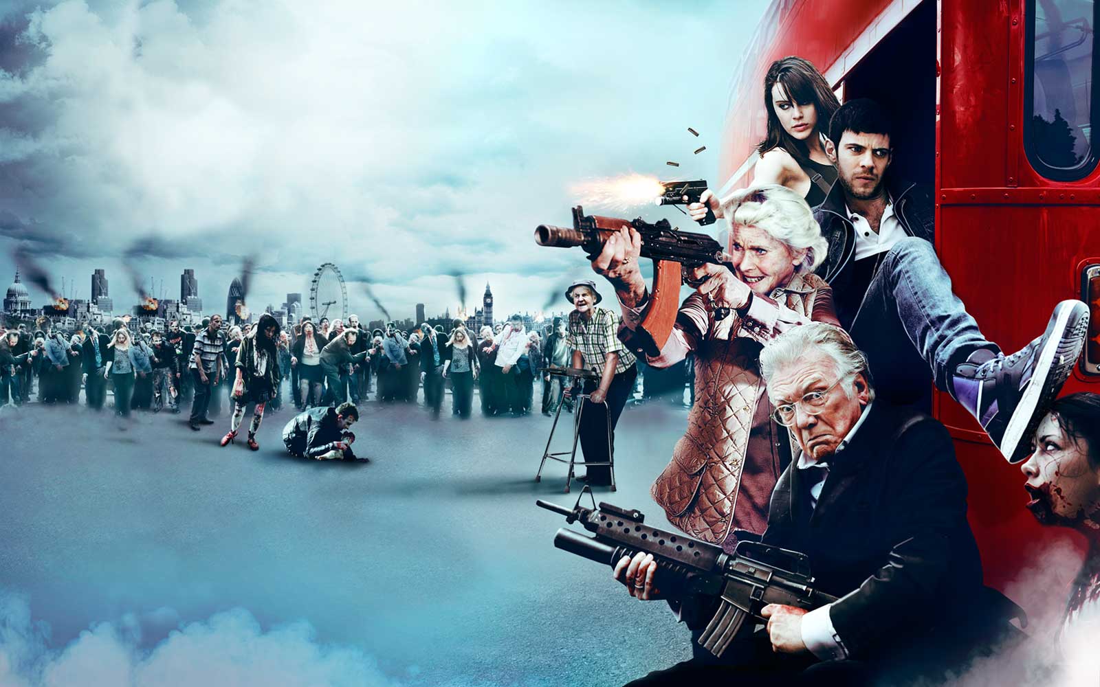
At a site in East London, two construction workers inadvertently unearth the tomb belonging to the late King Charles II. Upon entering the crypt, they are assaulted, bitten and unkilled by former plague victims. Meanwhile, brothers Terry (Rasmus Hardiker) and Andy (Harry Tread- away), with their cousin Katy (Mi- chelle Ryan), are planning a bank heist. The trio concoct this heinousness with a noble intent: saving their grandad’s (Alan Ford) retirement home from be- ing demolished by heartless property developers. But of course, everything goes pear-shaped when the entire neighbourhood is invaded by hordes of the undead.
Cockneys and zombies: that’s what the title promises and that’s exactly what it delivers. Given the self-conscious- ly schlocky title, you would expect a crudely-made, amateurish production,
the likes of which litter the internet. The truth is, thankfully, very different. Cockneys has quite a high production value. It’s not World War Z but footage of London enfolded in chaos and may- hem is rendered in good quality CG, as are the close-up shots of carnage.
Still, one problem with comedy zombie flicks is that they will forever be in the shadow of Edgar Wright’s masterful Shaun of the Dead (2004). Shaun was a perfect storm of comedy, horror, excellent production, inspired casting, and fortuitous timing. Just as everybody was trying to get his/her head around the seemingly dubious merits and immense popularity of tor- ture porn horror films (Saw and The Passion of the Christ were both released in 2004), in waltzed Messrs. Wright, (Simon) Pegg and (Nick) Frost who made everybody’s sides split with laughter.
Luckily, even though Cockneys vs Zombies is nowhere near as brilliant as Shaun, it still can hold its head high. Director Matthias Hoene and writers James Moran (Severance, 2005) and Lucas Roche touch upon, but don’t expand much, on the zombie-as-meta- phor angle. They just want to play it for laughs and get more hits than misses. The scene in which poor old Hamish (Richard Briers) is being chased by the notoriously slow-moving zombies is pure gold and West Ham United sup- porters can put their mind at rest that, even after death, the feud with Millwall still rages on. In an inspired scene, we are at last shown that even infants are not immune to a zombie infestation.
Cockneys is no (early) George A. Romero and does not aspire to be. It just wants you to relax, pop some corn, sip on soda, and enjoy a zombie-tour around the streets of East London.
Experiencing Stories
Earlier this year, the Valletta 2018 Foundation invited three tutors from the University of California to Malta to teach an intensive two-week course on screen-writing called Story Works to aspiring writers and producers. Two of the participants of the course, Kenneth Scicluna and Marta Vella fill us in on their experiences.Continue reading
You have to see the real thing!

But what does real really mean? Is there only one reality or are there multiple realities? These questions have been asked over and over again ad nauseum throughout humanity’s history only to end up with the same paraphrased answer: ‘Dear Sir, we can’t give you a definite answer since up to now we are not sure enough of what we are really speaking about.’ Socrates said reality is One, The Matrix says that the reality we experience is an illusion, while Stephen Hawking argues that reality is made up of distinct sets of laws of physics interwoven together into what he — plus a few other scientists — calls M-Theory.
Indeed the digital era has not improved the situation. What was once the domain of the tangible and spiritual world ended up expanding exponentially into virtual worlds entirly created by humans — a hyperreality! Indeed the hyperreal has found its way in the visual arts. In the 60’s Photorealist painters created paintings indistinguishable from photographs. Their succesors, the Hyperrealists, depicted photoreal realities that never actually happened.
How can a painting feel more real and tangible than reality? Up to the beginings of the last century mimesis (roughly means to imitate) was one of the main preocupations of western art. Artists made use of various visual tricks such as perception, occlusion, and chiaroscuro to fool the eye and give life to their works. But no matter how hard they tried they were doomed to failure because in an instant the brain would discover the illusion and reveal the flatness of the painted surface. The reason is simple, painted surfaces are monoscopic, from one point of view, whereas the brain builds a picture from what two eyes see to understand space and depth, a binocular system.
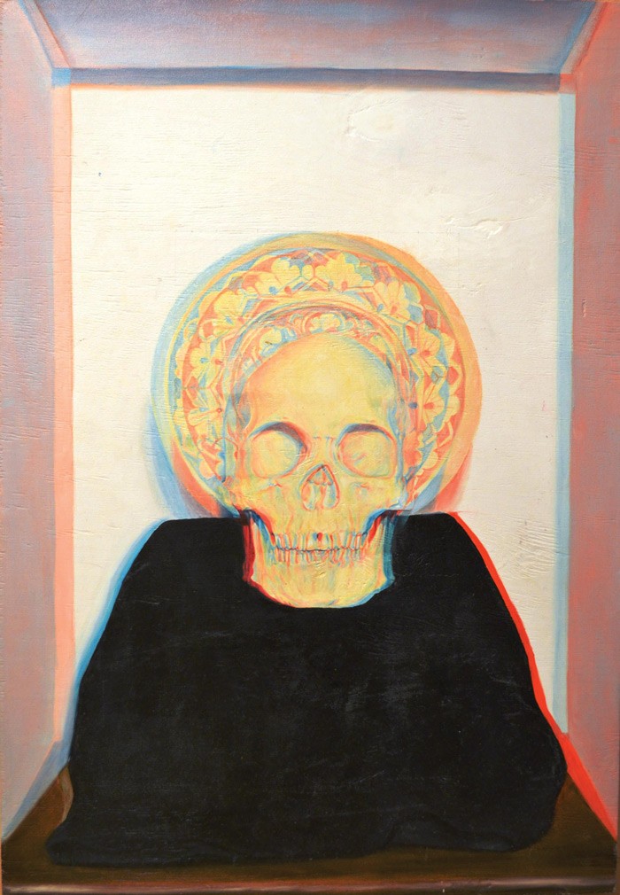
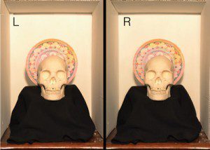
For this reason, Darren Tanti harnessed binocular vision to his advantage and implemented stereoscopic principles into his paintings to create 3D images. 3D images form in our brains when two images (a left and a right image) are set slightly apart. Our brain fuses the two images together giving the illusion of depth and form. The trick is to recreate the two images onto the same canvas with two different paints, to align them slightly apart as precisely as possible, and to calibrate colours to match the colour filters of 3D glasses. The right combination of all three creates a fully functioning 3D painting.
At first glance, 3D artwork might seem simple but there is a lot of work behind it. This technique cannot be used for its own sake. By combining it with other drawing or painting methods then there is a good chance to break ‘through the looking glass’ and enter a whole new world.
| Give it a try |
Below is a simple method to create an anaglyph 3D image. Words by Darren Tanti
|
Maniac: Two films. Two reviewers.

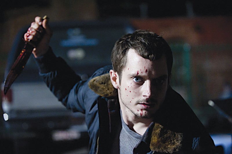
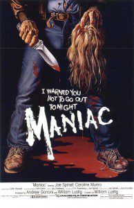
Noel: I recently saw William Lustig’s Maniac (1980) and Franck Khalfoun’s 2012 remake back-to-back. The latter is rather faithful to the original’s spirit. Frank Zito (played by Joe Spinell [1980] and Elijah Wood [2012]) is more of a textbook psychopath, and more brutal in Khalfoun’s film; but still remains faithful to its source.
Krista: I thought the first’s ‘rawness’ was more brutal. The second had a polished style despite the first person perspective. The 1980 film was grittier.
N: True. The remake looks slicker. For instance, the murder scenes are meticulously choreographed, operatic even. Lustig’s film is truer to life, scarier too, because in his lucid moments the killer acts normal.
K: The first person perspective didn’t convince me. Eventually I even forgot about it till it suddenly jumped to the fore again. It was inconsistent and uneasy without being very unsettling. It reminded me of Peeping Tom (1960), which made better use of the first person perspective.
N: Agree, but it didn’t distract me.
K: I hoped it would be more ‘distracting’. It would have been preferable if the first person perspective had been more defamiliarising, puncturing the viewer’s comfort zone — rather than just being ‘naturalised’.
N: The subjective point of view didn’t help me to get closer to the killer. I only saw this technique being used effectively in Enter the Void (2009). I find it a bit distracting because it can turn into a weird game (Spot the reflection in the mirror!). That said, in Maniac they were well aware of this and tried to have fun with it. The moments when the film veers away from the first person perspective, it sort of clicks into another gear.
K: Good point about the first person perspective being the default here, and the veering away from it becoming a ‘moment’ in itself. It calls to mind Bret Easton Ellis’ book American Psycho (1991).
N: I liked the fact that the remake created a deeper relationship between Frank and the mannequins. They are more than just a manifestation of his childhood trauma — a dysfunctional, promiscuous mother. The restoration of the mannequins is a genuine labour of love which underscores the affection that he nurtures towards the photographer (Anna, played by Nora Arnezeder). She is a mediocre artist unable to hold her camera properly. Frank is the real deal, getting his hands dirty.
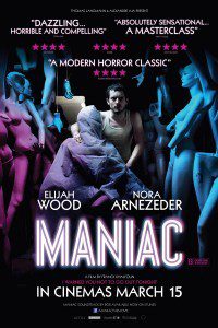
K: That’s a well-noted criticism of the photographer. In the first movie, I couldn’t really ‘judge’ whether she was a good artist or not — there wasn’t a focus on her art, instead they showed the world she moves around in, which made me think she was a budding artist. In the second one she’s portrayed as an underwhelming artist. She tries to use the mannequins to underpin her art and to somehow appropriate his by projecting an image of her face onto their blank heads.
N: Besides Anna, two other victims in Khalfoun’s film are a dancer and an agent. In both murders the director abandons the first person perspective, suggesting that either Frank is seeing his actions as a form of art, or that we, the audience, should see Frank himself as a work of art.
K: Yes, perhaps even perverting the sublime into the brutally grotesque. Yet ‘getting his hands dirty’ is counterpoised by the film’s stylishness.
N: So which is better?
K: Both films ultimately do different things. This is down to stylistic differences, enjoyably the remake doesn’t try to ‘replace’ Lustig’s film.
N: Totally agree. They’re like brothers sharing one (hell of a disturbed)
mother, similar yet so different. •
https://www.youtube.com/watch?v=4umIfrP_vMk
Mapping Cultural Space
Mama — Film Review
Electricity has killed the ghost story,’ said author Ruth Rendell while commenting on a tale by M. R. James. She has a point. The ectoplasmic posse thrives on darkness, occupying those spaces that elude the intrusive sanctuary of light. Thomas Edison and his light bulb must be the greatest ghostbusters of all time and Andy Muschietti’s film Mama, one of their latest casualties.
Candlelight encourages unnerving narratives: a flickering flame, after all, choreographs crazy cavorting shadows. And gaslight creates pools of light amid pitch blackness, which is why the Golden Age of the ghost story was between the 1830s and World War I, when candles and gas were mostly used.
A trip to the cinema combines all three: the film is essentially a beacon of moving shadows (candlelight) on a screen surrounded by obscurity (gaslight) and a source of electricity (the projector). In a way the cinema offers horror lovers what the ghost writers of old offered to readers: access to the land of the Bogeyman.
The Bogeyman, or Babau, or El Cuco, or whatever you want to call it, is scary as hell because we never get to see him. He is not really underneath the bed, or inside the closet, or waiting by the wayside to snatch those pesky children and put them in a sack. Then again, he might be there, waiting for the right moment to strike. Ghost stories need this kind of tension to instil a sense of dread.
“The latest movie trend is to dispense with tension in favour of a sedated compromise to appease a mainstream audience”
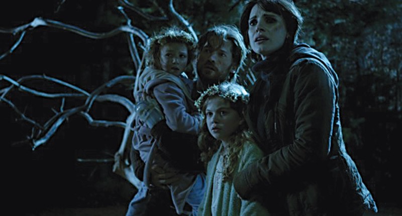
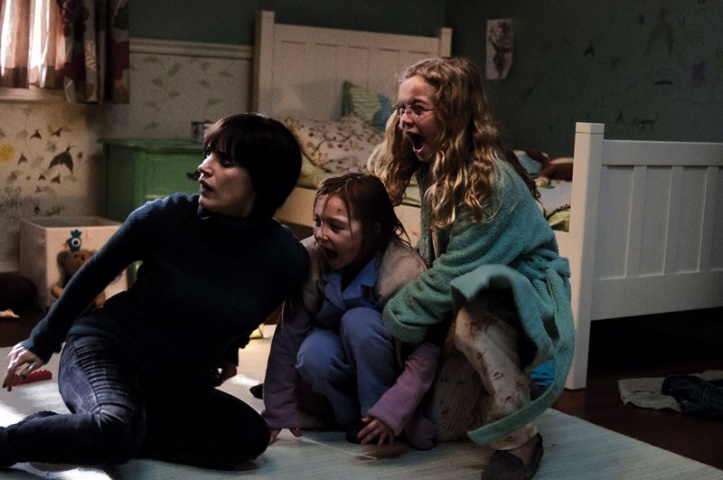
Unfortunately, the latest movie trend is to dispense with tension in favour of a sedated compromise to appease a mainstream audience. Mama falls into this trap. The film revolves around the battle between two mums, one alive and one dead. They are both surrogate mothers as the two girls’ real parent was killed by their very anxious dad. The arising conflict drives the narrative forward but then everything goes belly-up when the ghost, in all its CGI glory, takes centre stage. And, of course, CGI is all electricity.
Once the ghost of Edith Brennan becomes a central figure in the story (visually), the excellent sense of amassed dread all but disappears. Instead, CGI wizardry takes over: magnificent wraithlike tendrils of ghostly garb, creepy head tilted at a slightly awkward angle, a face that might stretch and scream at any moment, giving us the intended scare. We are shown too much. Movies such as Paranormal Activity (2007) and The Innkeepers (2011) take a better approach by creating and sustaining suspense by only showing the bare essentials. They leave you gripping your seat.
So: is Mama any good? Well, yes, in an average-film kind of way. But there is definitely no need to watch it with your lights on.


