

Do you feel safe walking around after dark? Does the size of the city affect how you feel? How do these feelings compare between men and women? For data analysts, these questions come with unwieldy amounts of data. Luckily, Dr Gianmarco Alberti from UM’s Department of Criminology (Faculty of Social Wellbeing) has authored free software that visually portrays data patterns in a practical way.
So how does the software work? Going back to our safety in the dark example, the data is plugged into the software. The programme then explores how the feeling of safety relates to the size of the city. In this example, we’ll split the variable ‘feeling safe after dark’ by gender and see if it’s influenced by the number of people living in the city (‘town size’, represented at the top of the first image). The table below is small yet highly complex (see figure 1), finding any obvious pattern of association between categories is hardly an easy task.
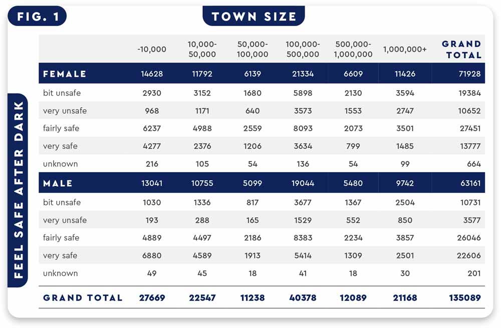
Table 1: presents how safe male and female participants feel after dark (column 1) compared to the population size of the city (row 1)
Plugging this data into Alberti’s software, named ‘CAinterprTools’, provides a body of facilities that allow users to get the most of those results (see Figure 2). With this image, it’s easier to understand that the bigger the town (right side along the horizontal axis), the less safe interviewees felt. Both males (identified with an M) and females (identified with an F) have the same perception of their safety in a smaller town (points in the left-hand side of the chart). However, as the size of the town increases, females start to feel less secure than men (points to the right-hand side of the chart). It is clear that this approach can provide insights into data structure and help reveal hidden patterns.
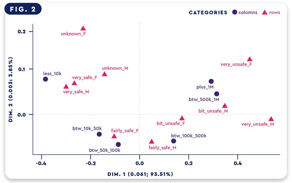
Figure 2: shows a visual representation of the data presented in Table 1. The size of the city is marked with black points, while how safe participants felt is symbolised by the red triangles.
The beauty of Alberti’s program is that it increases data analysis efficiency, not only to researchers (e.g criminologists, political scientists, or biologists) but also to citizens and several entities that work with data (e.g. banks, customers, or companies). The fact that this software was developed under the free R statistical programming language means it is a free resource which can allow for an easier way to interpret data – especially for those who aren’t math-oriented! Let’s hope this leads to safer streets for all!
The programme can be found here. The data used in the table was taken from the International Crime Victim Survey – https://wp.unil.ch/icvs/




Comments are closed for this article!