

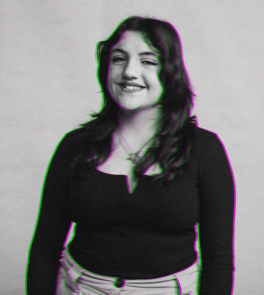
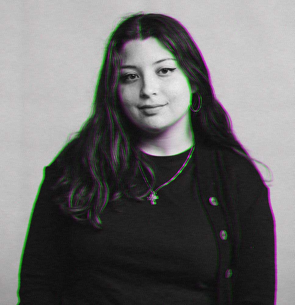
Our impression of a brand shapes our experience of the product or service involved. Five students from the Bachelor of Fine Arts (BFA) in Digital Arts looked into this, involving their own interests in the medium.
Branding allows companies to tell you who they are through a curated set of design choices. For designers, this involves a variety of skills and a process of stitching together a distinct brand identity. Rhea Fenech, Martina Fava, Martina Spiteri, Abigail Cassar, and Amy Grech Pirotta each applied branding to dig deeper into their distinct aims of research and practice.
Rhea Fenech – Vivid Movement
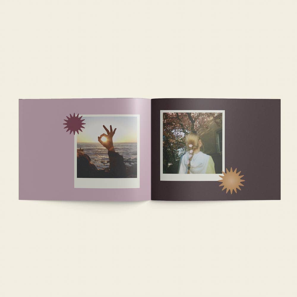
Finding out how your dream business could present itself is an essential element of its realisation. Rhea Fenech saw her dissertation as an opportunity to do so, engaging in some of her favourite angles to digital art as a first step towards opening a dance studio.

Rhea herself has been learning dance from the age of two, leading up to her current interest in hip-hop and freestyle dance, which are the foundations for Vivid Movement, a dance studio which she plans to create. Her project involved developing a logo and style of photography for the studio. ‘I wanted to do it in a different way than the usual sketching process. I wanted the dancers to be part of this logo, so I used light painting photography to do that.‘ Light painting photography is a technique that allows for the movement of light to be captured as a long trail. ‘The dancers were moving with a light attached to them, creating trails of light.’
The logo was built on colour research and experimentation developing a technique of light painting photography which worked for her. ‘It was a challenge to actually figure out how to do light painting photography well and figuring out what lights would be best. There was a lot of different experimentation with different lights and things not working.’
She explains that the photo she settled on features the letters which make up the abbreviated brand name. A distinct V for ‘vivid’ forms the first shape in the logo, while the second shape represents ‘movement’ as a free-flowing set of gestures.
Throughout the journey, her research process has been pointing her in productive directions. ‘It definitely helped, especially when it came to the technique. I researched colours, and that helped for sure. The colours in the logos have a specific meaning – orange is a happy colour; it makes you want to dance, and cyan refers to loyalty, but it’s also really good for photography!’


Martina Fava – Packaging the Person
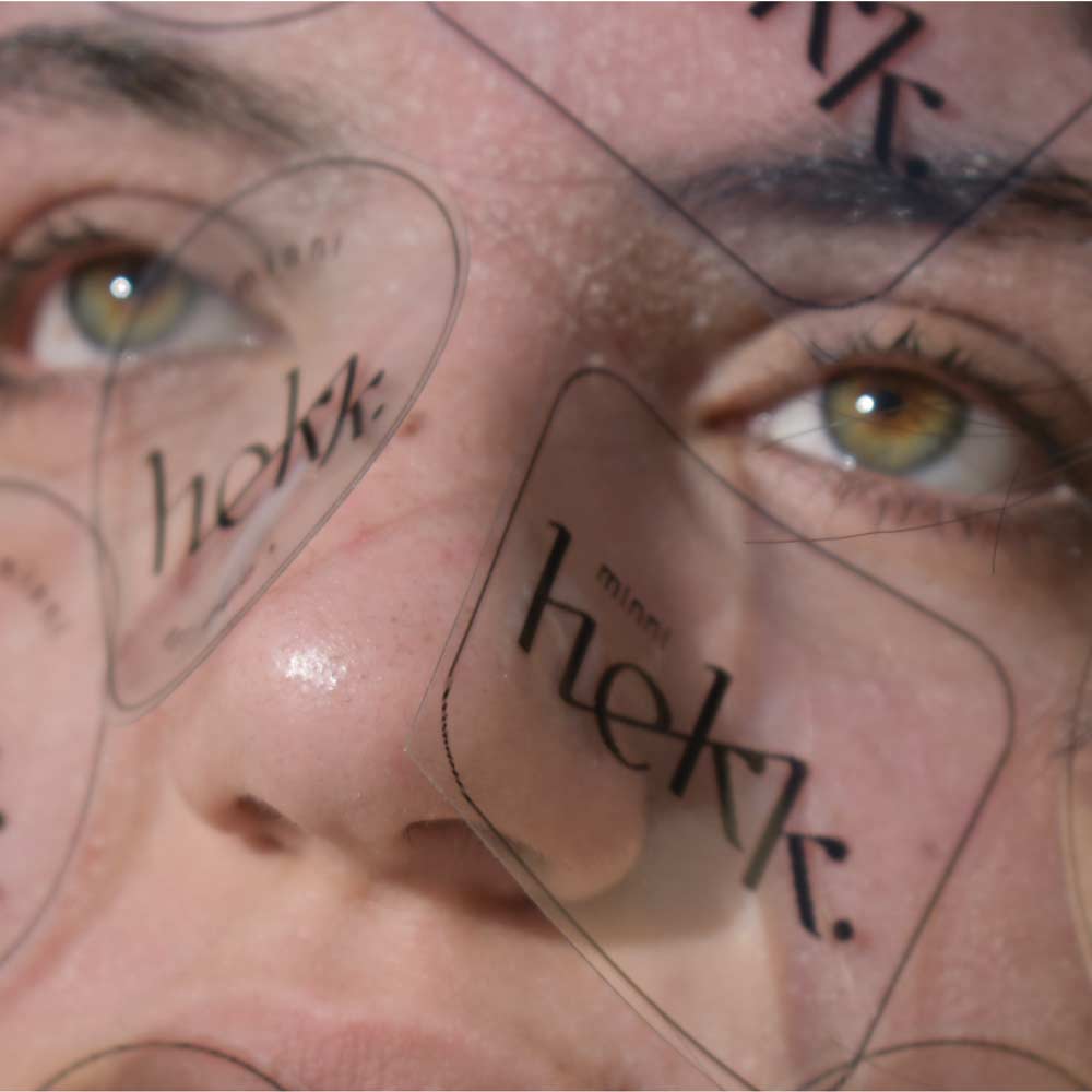
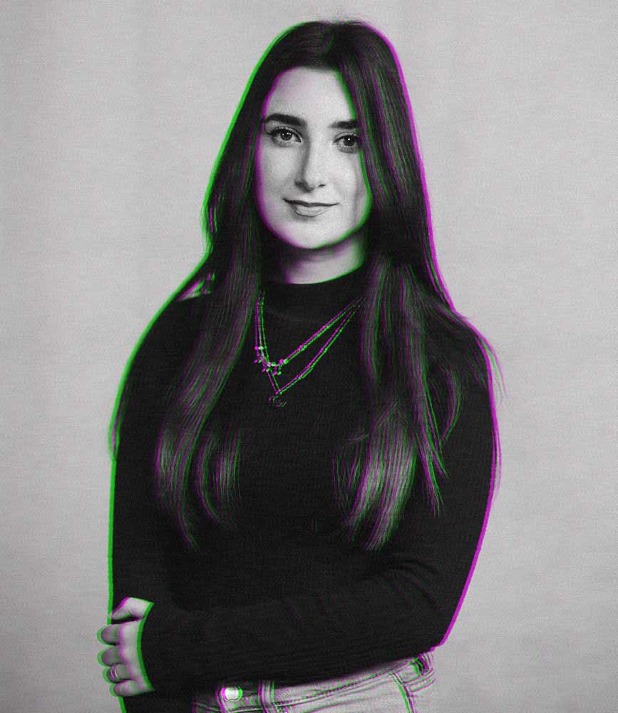
Our understanding of beauty is determined by external factors. With Western cultures, one could search anywhere from the Greeks to developments in fine art to think about how we see beauty. Martina Fava took this into her research, even looking into the marketing of the cosmetics industry, but she found that her study would be most effective when directed inward. For Martina, this meant tackling her own struggle with self-image relating to her skin condition and how she felt in our society.
Martina was driven to take a conceptual spin on branding in the cosmetics industry. ‘I knew I wanted to create a brand, because I knew it would be impactful to create one that goes against what other brands are doing.’
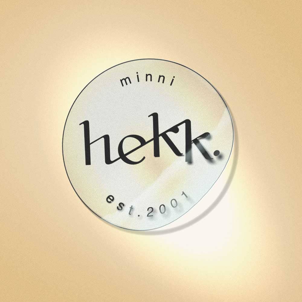
Her goal was to package the person. She meticulously crafted a logo – transparent and typographic – bearing a bold Minni Hekk. Her idea was that in swapping out the logo of a typical make up product with hers, the change would be unnoticeable to viewers.
Bearing the history of beauty ideals in mind, she wanted to do a photoshoot where the symptoms of her skin condition were at their most visible, with her brand logo stuck on herself. ‘I think the main challenge was actually taking the photos, because I wanted to show my flaws, but at the same time when I was taking the photos, I didn’t want to share them – it was kind of conflicting.’
‘If I’m packaging the person, then the person is a product.’ Visitors to Martina’s stand saw a brilliant publication – her spoof of makeup product catalogues. Every page features a large print of one of the pictures from her shoot, accompanied by a punny product code and a description. ‘I was actually placing myself instead of the product, so that’s how I came up with the product code. I followed how product catalogues actually are.’
Looking back, Martina realises the journey this project has taken her through. ‘This project kind of helped me personally as well. I was satisfied – not only because I was raising awareness and sharing it with everyone – but at the same time, when I kept looking at the photos, seeing what I did and seeing the professional stickers printed and the brand. I was very happy with it as a project and how it turned out, but also because I managed to do it all about myself and being okay with it, not feeling bad about the photos.’
Martina Spiteri – Second-Hand Identities
Branding focuses on expressing an identity. On an individual level, clothing can take us in a similar direction.
‘We know that clothes give us identity, so, since second-hand clothes already gave an identity to someone, I wanted to see if the second-hand owner sees the same attributes.’ This research builds towards fictional brands that Martina pieced together for each piece of clothing. ‘I used the information that I got from my participants to create brand identities – I asked about the colours and the font style and built the brand names considering what could reflect both owners.’ Her research process proved a major challenge, yet it let Martina directly evaluate the similarities between owners and the values they attribute to the same clothing.
What started as a project in branding transitioned remarkably into an interactive display. She produced tags for the clothes, featuring sets of qualities which the owners attributed to the pieces. This nudged the audience to engage with the concept while browsing through the clothes presented.
‘I really wanted the audience to be aware of the clothes that they are wearing and not take them for granted. It was sort of a game – the audience really enjoyed it; they flicked through the clothes, finding ones they identified with – and then read the tags to see if the owners’ idea of the clothes overlapped theirs.’
A publication was also produced, telling the story of the clothes and Martina’s design choices. ‘I chose to make these booklets since each garment has a story to tell. Through the pages, I used elements that I designed to reflect these identities and gave some information to show why I chose certain things.’
For Martina, what was important was allowing people to appreciate what their clothes give them. ‘I was very happy seeing people go through the clothes because for me, them being excited was thrilling. The people were interested in this concept.’

Abigail Cassar – Online Branding in the Hospitality Industry
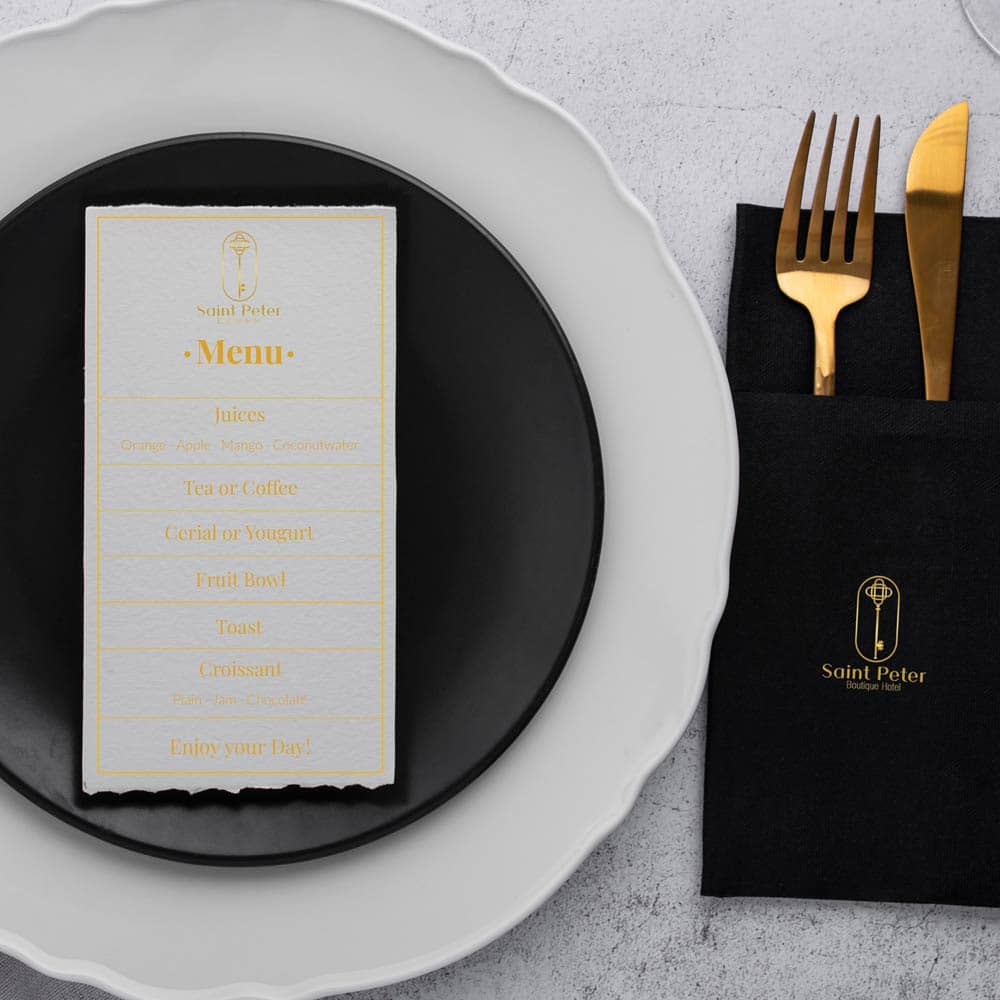
When browsing small hotels online, how often do you wonder whether the photos are representative? Abigail Cassar thinks that amping up the user experience could boost how customers feel about staying at an accommodation. Additionally, it could place small-scale accommodation providers on a more comparable level with larger hotels.
Abigail’s research proved that this is both necessary to prospective customers and at times seemingly unfeasible to boutique hotel management staff. ‘Bigger hotels can dedicate a bigger budget towards marketing, whereas small hotels cannot. My aim was showing what they can do for free – like opening up a social media account, taking good photos of the place, and giving a virtual tour of their hotel.
Her goal was to not only come up with the branding, website, and marketing for her own hypothetical boutique hotel, but to do so in a way that is feasible for actual boutique hotels.
She came up with St. Peter Boutique Hotel, a high-end, intimate stay. Her elegant use of fonts, the lush gold and silver tones, and the intricate key featured in the logo build up to a luxury brand. She alludes to the gold and silver keys which St. Peter is said to carry at the entrance to heaven.
For Abigail, the largest challenge was developing her website. She went into user interface and user experience design to create a site which followed brand identity while being informative and easy to navigate. In the end, seeing exhibition attendants find her website easy to use and aesthetically pleasing brought her great satisfaction – this was now a practical example of the effective user experience values she researched.

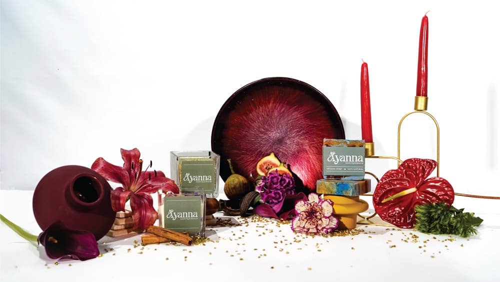
Amy Grech Pirotta – Ayanna
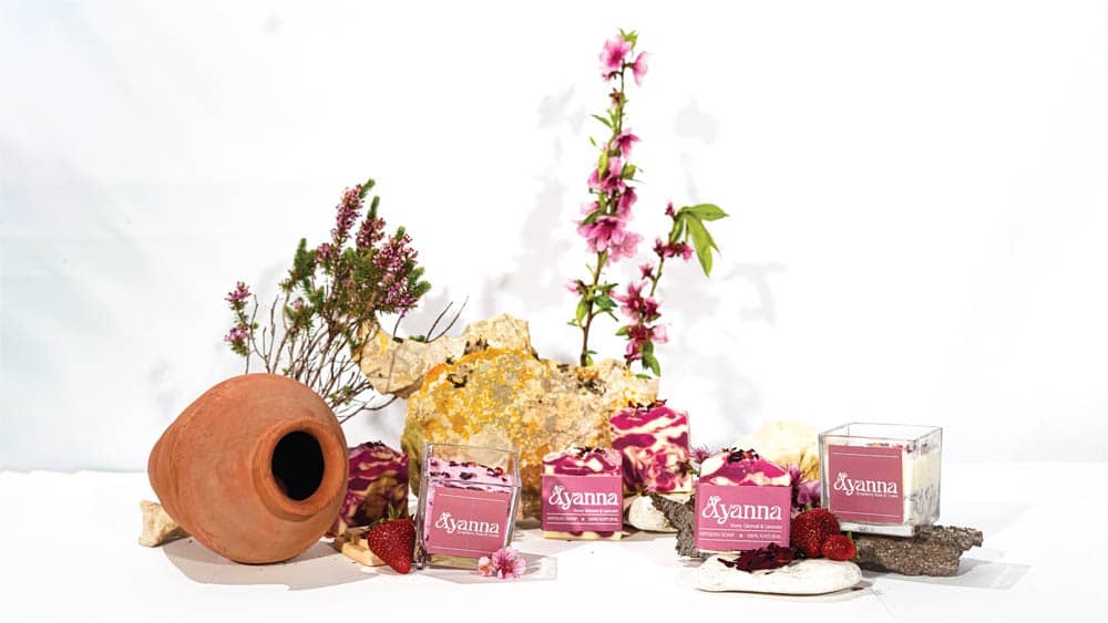
Though Malta has the resources for it, luxury self-care products such as candles, artisan soaps, and body scrubs remain predominantly imported. A marketing and graphic design oriented student, Amy Grech Pirotta saw her dissertation as an opportunity to create a real brand, with real eco-friendly products. Her skills built towards a brand that carries its Maltese identity subtly: one that feels crafted and customised for each product.

‘I knew that I wanted to use such things as Maltese resources, but I needed to research what I could actually create. Looking into the external and local environment and what there is in the market at the moment, I began to notice a need for local natural products.’
Amy directed her research towards marketing, evaluating tried and tested practices. Sifting through what made the branding she likes work and considering the dos and don’ts her research pointed to, Amy built towards a luxury, modern feel – thinking about products that customers would want to feature on their shelves and the experience of unboxing.
‘I wanted to integrate the trend of unboxing videos. The packaging needs to be something worth taking a picture of, making the design factor important.’ Packaging the products themselves, Amy considered the local factor and wanted to represent it subtly. ‘In fact, the flower in the logo is a rendition of the Maltese national flower, but it needs pointing out to be noticed. Malta being a bright country, I had bright colours in mind early on – wanting a balance between colours that were bright enough to connect to consumers while neutral enough to belong in bathrooms.’
Bringing these colour-rich packaging concepts to print presents production challenges. Despite these obstacles, Amy is heading to an official brand launch later this year.
These five students each form a part of an entire exhibition among their Bachelor of Fine Arts class. The exhibition was held on the 20th and 21st of May in the Faculty of Media and Knowledge Sciences building on campus. Their work is presently displayed on their website – impressionbfa.art. This article is the final among a series of conversations with this year’s graduating class in Digital Arts, with the rest of our conversations being as varied as the students themselves.

Comments are closed for this article!