

As part of their coursework, a group of Media and Knowledge Sciences students following a Bachelor’s of Fine Arts in Digital Arts were tasked with the challenge of rebranding CampusFM, the University of Malta’s official radio station. THINK speaks with Olga Sater, one of the students who worked on the rebranding project, about their journey.
As they near the culmination of their bachelor’s journey, digital arts students at the University of Malta are afforded a unique opportunity to collaborate with a professional entity. This experience serves as a bridge to the professional world, as students engage with real clients. Their journey includes the development of rebranding and client presentations, all under the watchful guidance of lecturers Dr Trevor Borg and Prof. Vince Briffa.
While these assignments remain a crucial aspect of their final assessment, it’s not always the case that the project is chosen by the client. However, Sater’s team achieved a distinctive outcome, as their creation was selected to become the official rebranding for CampusFM, a noteworthy entity intimately connected to the university, serving as its official radio station.
Sater, a mature student with a background in marketing, was passionate about the creative aspects of the field, which drove her to pursue this degree. ‘It was a plus that the digital arts degree offered at the University of Malta was wide and not focused on a specific career path. The course was well-designed and allowed us to explore a variety of fields, giving us a spectrum of different areas and choices. It strikes a good balance between conceptualisation and practicality, encompassing both traditional and modern media,’ explains Sater.
She recounts her prior freelance experience, stating, ‘I had some experience with rebranding, but I never did anything from scratch. It was more about refining existing brands.’ Alongside Anthea Mifsud, Nicole Elena Cassar, Max Roth, and Miguel Attard, the group’s collaborative effort resulted in the official selection of their design for CampusFM.
From Brief to Brand
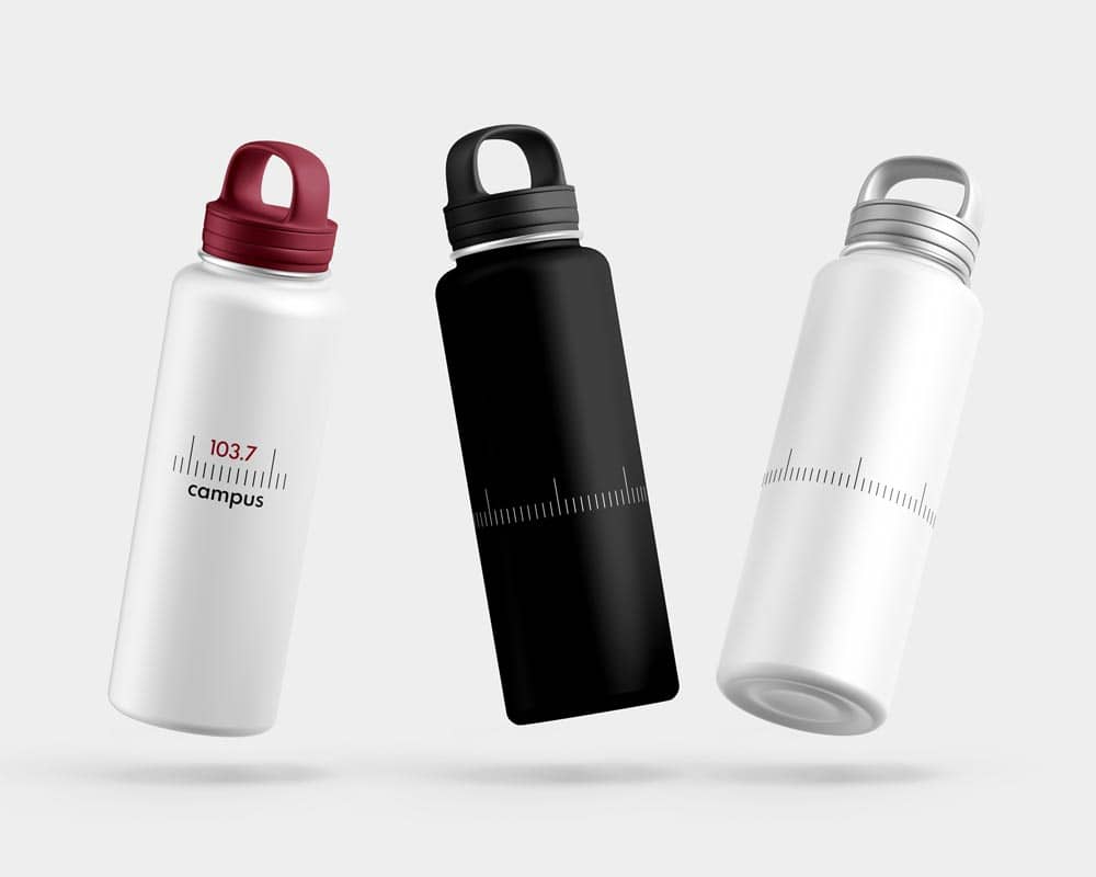
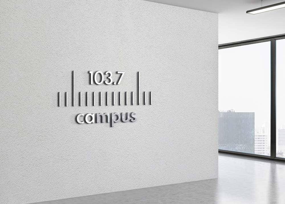
The process commences with an initial brief from the entity, followed by students forming small teams to delve into the project. ‘In their brief, the client expressed a desire to move away from their current colours and fonts. The concept of “frequency” was to be emphasised and integrated into the radio station’s name while still maintaining a connection with the university,’ remarks Sater.
To capture the essence of ‘frequency,’ the team engaged in a series of experiments to represent it graphically. As Sater says, ‘Ultimately, we drew inspiration from the vintage radio tuner scale bars, which resonated with the radio concept and its historical heritage tied to the campus.’
To craft a distinctive brand identity that could be instantly recognisable and appealing to the younger target audience, when it came to merchandise, the team introduced elegant options featuring only the frequency symbol. ‘Such design, apart from serving as an identity element, can also function as a brand identifier on its own. However, it’s crucial to maintain a clear hierarchy between the elements,’ explains Sater.
Concerning the audience, for this rebranding exercise, the team faced the challenge of appealing to two distinct target audiences: a mature demographic, representing the majority of listeners, and a younger, more playful student demographic they aimed to attract. This vision led to the development of comprehensive brand guidelines.
Drawing inspiration from premium brands with broad audiences, when it came to colours, the team opted for a monochromatic approach. They believed that one colour, when thoughtfully chosen, could prove to be versatile. In Sater’s words, ‘this choice allows for the creation of a contemporary graphic language that takes a historical asset, represents it in a minimalistic manner, and introduces a colour that resonates with the university. The result is an elegant, minimalist, and versatile brand that maintains a connection with the university through a dark red accent colour.’
To complement its monochromatic tones, the team incorporated vibrant photography. Enhancing the brand’s versatility, in ‘light mode’ of the proposed mobile application interface design, the photos exude elegance, while when switched to ‘dark mode,’ the imagery transforms, presenting more vibrant visuals.
‘Versatility has the ability to apply across different media and meet different requirements,’ emphasises Sater. While it’s not possible to guarantee timelessness when launching a new brand identity, the team aimed to minimise the risk of becoming outdated by adhering to minimalistic and versatile design principles.
Unveiling Professional Potential
The CampusFM rebranding exercise has had a profound impact on the students’ future career plans. While Sater’s prior experiences revolved around client service, as a student, this project introduced her to a new dimension as a developer, offering fresh insights and learning opportunities. ‘The fact that our work was chosen as the official rebranding was a meaningful validation of the collective effort and contributions of the entire team. This project exemplified the power of teamwork, with open discussions, feedback, and mutual assistance, mirroring the dynamics of real-world client interactions,’ remarks Sater.
‘I consider this a significant addition to my portfolio that successfully survived every stage and was brought to life, reinforcing my belief in my potential for success in the professional world. It serves as an encouragement for students, as it demonstrates that opportunities are presented, and with boldness, dedication, and belief, they can be transformed into achievements,’ notes Sater. In today’s highly competitive professional environment, this achievement instilled the team with a sense of inner encouragement and the confidence needed to embark on their careers. This project serves as a powerful reminder that with dedication, boldness, and belief in one’s work, student creations can transcend academic boundaries and come to life as real-world successes.


Comments are closed for this article!