
The artistic process is rarely smooth; experimentation and exploring unorthodox connections are the bread and butter of artists. Five students from the Bachelor of Fine Arts (BFA) use their art to push the envelope further.
Good art often pushes us outside our comfort zone. By probing unconventional angles and engaging with offbeat concepts, artists manage to question the structures we take for granted. Eneh Lang, Jeanluc Zammit, Christian Bugeja, Carlos Cutajar, and Ian Farrugia experiment with the conventions of art.
Eneh Lang – Exploring Frame Rates in Relation to Perception and Narrative
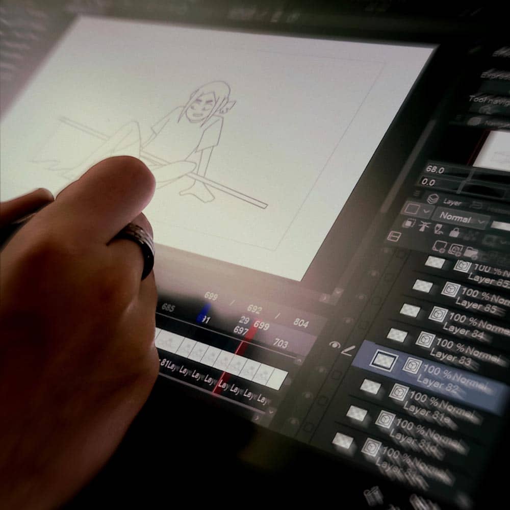
The standard frame rate for a movie is 24fps (frames per second). If animated media is done right, you shouldn’t notice the frame rate. In fact, unless you’re a gamer or a big fan of animation or film, you’ve probably never even heard of fps. However, Eneh wondered whether the framerate itself could be leveraged as a tool for the narrative.
‘I wanted to investigate how frame rates affect the narrative and viewer perspective,’ Eneh explains. ‘My biggest source of inspiration was the Spiderverse movie that came out a few years ago. They used frame rates to tell the story. It used several different types of frame rate and matched it to the character on screen at the time. For example, the mentor character is shown at a higher frame rate than the student.’ The higher the frame rate, the smoother the image on screen. ‘This shows the mentor as more confident, while as the story progresses, the student character grows and their frame rate increases.’
Using this as their starting point, Eneh created an animated short. They created two versions, one with a fixed frame rate while the other had a varying rate. The audiences’ reactions were documented in order to see which version was more effective.
For Eneh, time restraints proved to be a considerable challenge. ‘I had put off doing the animation bit for a while; instead I spent a lot of time on the narrative aspects. If I had time, I would have fixed some of the pacing issues. Make certain segments longer and have more time with the general post editing. But I had to keep it simple.’
Fortunately, the project helped Eneh to improve their animation skills. ‘I think if you compare the scenes I animated in the beginning compared to the later ones, the later ones are much better. Overall, I really enjoyed working on the project, even if it was a source of major stress!’
Jeanluc Zammit – Non-linear Narrative in Video Games
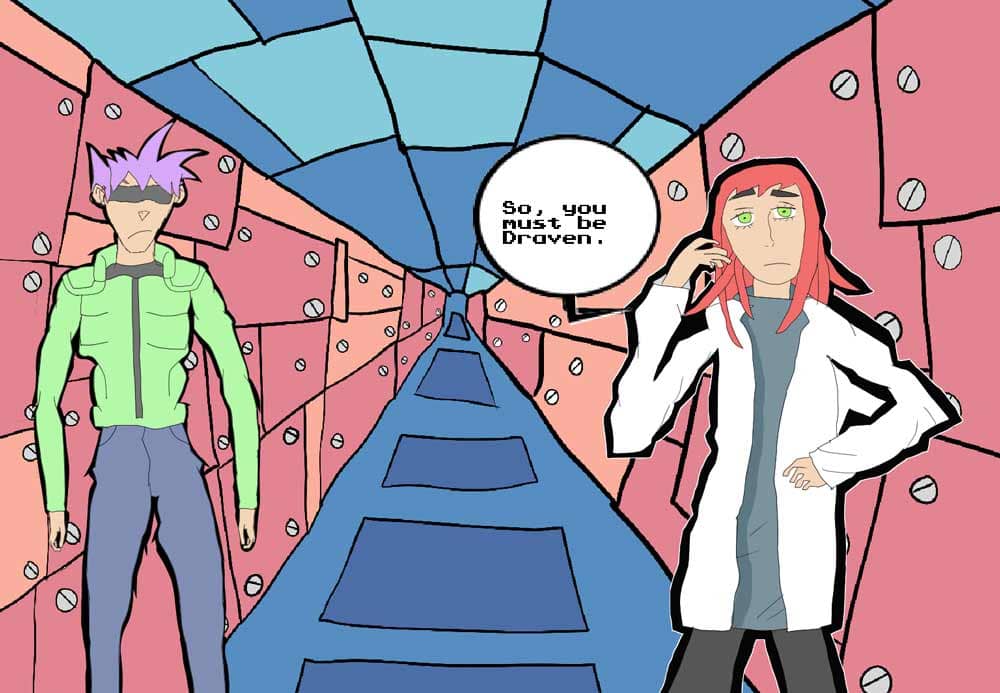
Traditionally, video games started out as arcade booths with a linear story or a set of challenges. Since then, video games have matured as a medium, and numerous developers have experimented with the format. For Jeanluc Zammit, he wanted to create a game where the story changes depending on the player’s progress. ‘If you manage to accomplish one mission, for example, the story goes one way. But if you fail, the game won’t end, instead the story will go in a different direction.’
Growing up as a gamer, Jeanluc’s inspirations include a number of video games, the main one being Shadow the Hedgehog (Sonic’s arch-rival), as well as manga and anime. ‘Specifically, I was inspired by The World Ends with You. I fell in love with its comic book style and wanted to make something similar.’
The game itself follows the story of Draven, a soldier trying to regain his lost memories. Jeanluc explains, ‘There are characters who might help or hinder him. The idea is that in order to get the full story, the game requires multiple playthroughs.’
For Jeanluc, the challenge was the programming. ‘I’m more of an artist than a programmer. I wanted to programme the game’s cutscenes so it read more like a manga comic. That proved to be quite difficult, as whenever I ran into an issue, I would have to go back and try to understand what caused the problem.’
Jeanluc hopes to continue developing the game in the future. ‘I always wanted to become a storyteller and artist, working on comics and video games. This project helped me learn how to plan out a story and the individual details needed to create a cohesive narrative. The branching narratives helped me develop as a storyteller, while the programming aspect allowed me to improve my coding skills!’

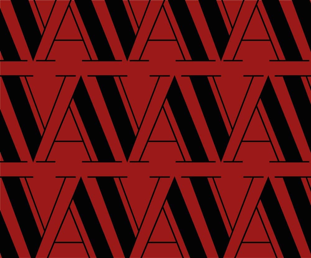
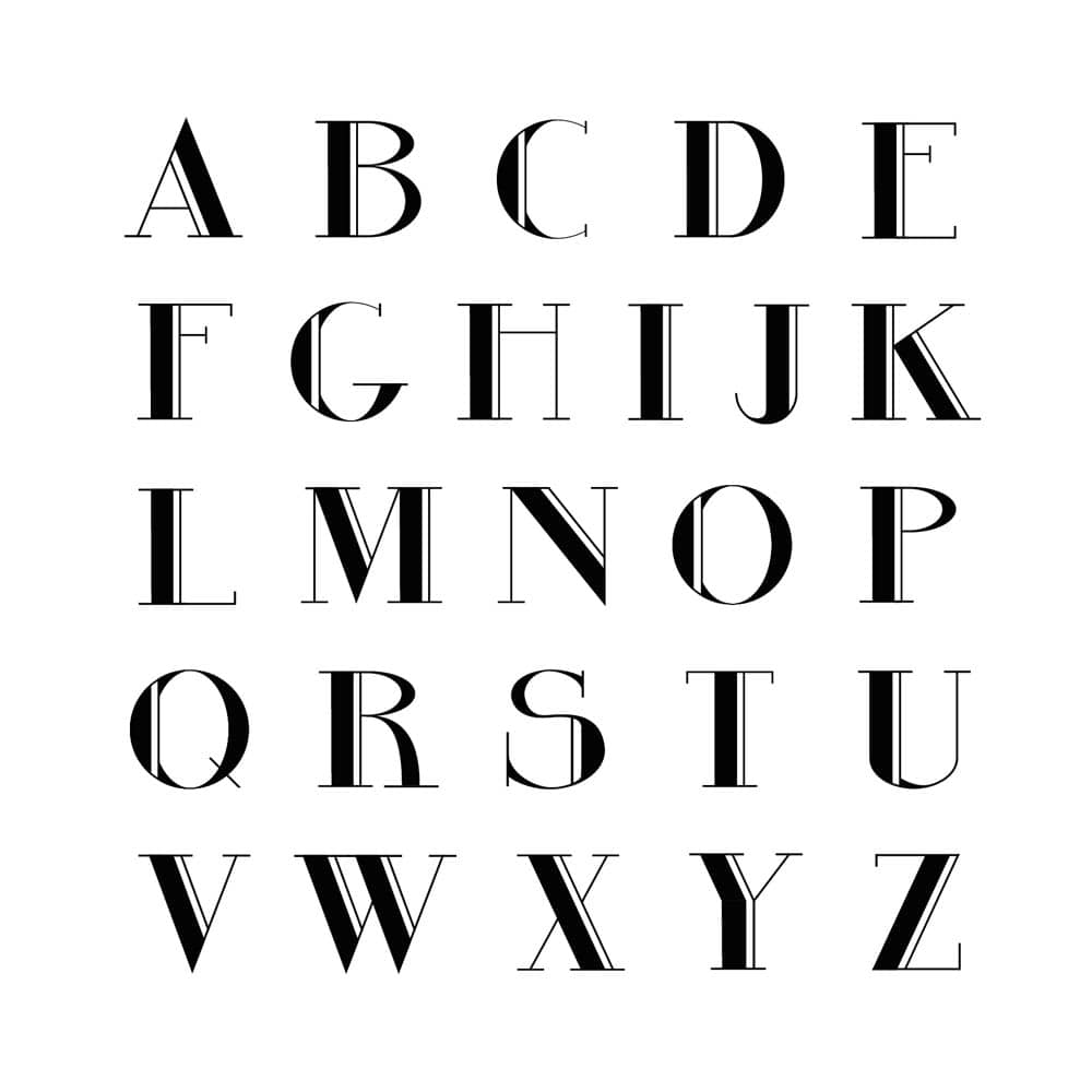
Christian Bugeja – Designing a Modern, Serif Typeface Inspired by Art Deco.
You might not think twice about the fonts you use (unless you use Comic Sans). However, for designers, the right typeface is crucial to reflect the tone and personality of what they are trying to say. For Christian Bugeja, his goal was ‘designing a serif typeface that felt modern… Most of the typefaces I saw were sans serif, and I noticed how many of them were bland and dull. I wanted to create something new and unique.’ Serif typefaces have an extra stroke at the end of their letters, while sans-serif ones do away with these extra strokes. Incidentally, the font you’re currently reading is sans serif.
Christian explains that the difference comes down to how people perceive it. ‘Serif typography is seen as more formal, while sans serif is more modern looking and became quite popular as technology advanced. On most modern computers, you’re more likely to see sans-serif fonts.’
Christian draws his inspiration from the Art Deco movement, which originated in the 1920s. He describes the movement as ‘a lavish style filled with decoration,’ yet ‘ironically, Art Deco typography is predominantly sans serif.’ His work combines the decorative aspect of Art Deco with the more minimalist serif typography.
However, designing a new typeface is a laborious process. ‘A lot of detail needs to go into each letter. Initially I wanted to include the full typeface, composed of both uppercase and lowercase letters. However, I had to make the decision to only design the uppercase letters. It still worked, as it’s meant to be used as a display typeface.’ A display typeface is mostly used for signage or headers — rather than long bodies of text.
‘Along the way, I had an introduction to typography. I wouldn’t say I’m an expert at typography, but the project provided me with a very good introduction!’
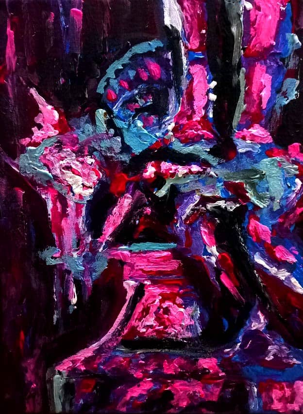
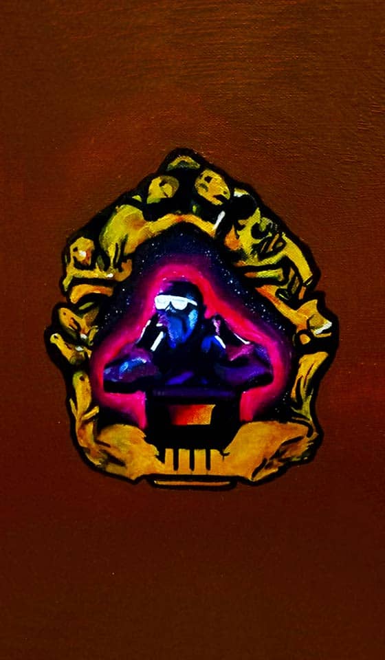
Carlos Cutajar – Translating the Baroque into Contemporary Digital Art
You’d be forgiven for thinking that baroque is an antiquated art style, with its theatrical features and exaggerated use of gold. However, for Carlos Cutajar, baroque has a lot left to teach modern artists. ‘I wanted my art to show that baroque is not simply an anachronistic phase in art history, but a source of inspiration for present-day art. Its elements of drama, chiaroscuro [high contrast in painting], exaggerated dynamism, can all be applied to the contemporary.’
Malta is renowned for its wide array of baroque art. ‘My starting point was the local feasts. I love putting a lot of detail in my work, so baroque with all its details was perfect for me.’
Carlos’ art tries to translate these aspects of baroque into modern art. For example, Carlos uses the traditional Baroque niche, which usually features a saint or other holy figure, to create An Ode to Mr. West featuring Kanye himself. Another example is his Ukiyo-e Woodblock print. ‘In its time, baroque only focused on Western figures. But I wanted to modernise baroque by using this idea of inclusivity. Coincidentally, Ukiyo-e was happening in Japan during the baroque period,’ Carlos explains.
‘Although not all the works look like an abstract, contemporary piece, I wanted to show that baroque can still be contemporary with regards to inclusivity and the use of colours. For example, I used modern, neon colours in certain paintings. I wanted to convey baroque in a contemporary way, using contemporary means.’
Ambitious in scope, Carlos’ work tries to revive the baroque movement, using its elegance and techniques to create something new from it.
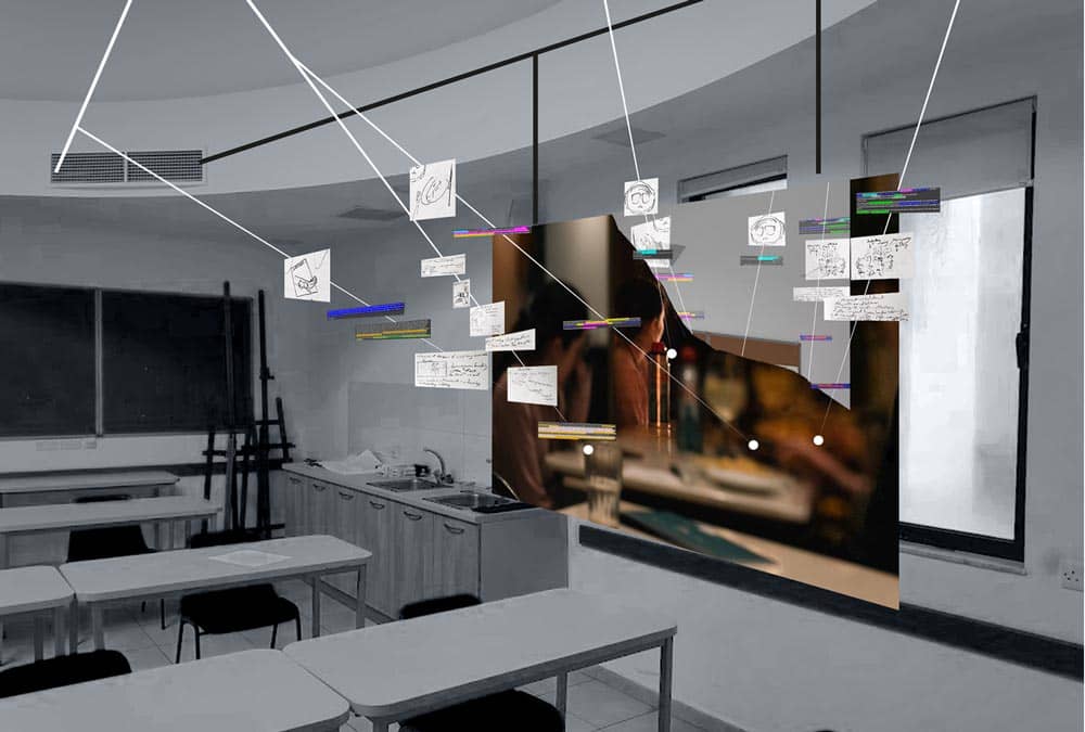
Ian Farrugia – Consulting the Muse
The relationship between the artist and the muses can be fickle. The muses come and go as they please, while the artist struggles to bring their thoughts to life. Ian Farrugia’s art aims to ‘directly plot the development of an idea — the process — from consuming media, to finding that media as an inspiration, to creating art.’
Upon walking into the exhibition, Ian’s art presents itself as a large board with scraps of paper and notes dangling from a web of string, reminiscent of the murder maps found in thriller and detective fiction. Ian explains, ‘The strings are parallel to thoughts, showing a sequence of ideas or a pattern of thinking. Starting off my experiments with short stories from The New Yorker fiction podcast, I figured out how to map out each reaction I had as my ideas developed. After that, I was then able to map ideas and imagery across the reading process.’
Consulting the work of phenomenological philosophers and literary theorists, Ian examines how fiction (and media consumption in general) can serve as a stimulus for visual expression. ‘Meaning is created the moment the reader consumes the text. You need to be open and as reactive as possible to what you’re consuming. The more responsive the viewer, the more productive the reading session would be.’
By exploring his own reactions to the text and following the threads of thought that arise, Ian manages to develop a mind map of the creative process. ‘Developing this method in a way that was academically legitimate was a long process!’
Analysing the creative process is not without its fair share of challenges. ‘Making the method was the hardest part, while reading the context of writers and their critiques was also quite intense. But testing the method out was certainly the most exhausting part.’ Fortunately, Ian is optimistic about his study: ‘the method allows me to explore how my own creative brain works. Understanding my own process was a main goal, and I’d love to see what others could do with it!’
These five students form part of an entire exhibition among their Bachelor of Fine Arts class. The exhibition was held on the 20th and 21st of May on the fourth floor of the Faculty of Media and Knowledge Sciences building on Campus.
Comments are closed for this article!